|
superclass: vertical-panel% |
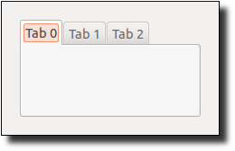
The tab-panel% class does not implement the virtual swapping of the panel content when a new tab is selected. Instead, it merely invokes a callback procedure to indicate that a user changed the tab selection.
constructor
(new tab-panel% [choices choices] [parent parent] [ [callback callback] [style style] [font font] [enabled enabled] [vert-margin vert-margin] [horiz-margin horiz-margin] [border border] [spacing spacing] [alignment alignment] [min-width min-width] [min-height min-height] [stretchable-width stretchable-width] [stretchable-height stretchable-height]]) → (is-a?/c tab-panel%) choices : (listof label-string?)
parent :
(or/c (is-a?/c frame%) (is-a?/c dialog%) (is-a?/c panel%) (is-a?/c pane%))
callback :
((is-a?/c tab-panel%) (is-a?/c control-event%) . -> . any) = (lambda (b e) (void))
style :
(listof (or/c 'no-border 'can-reorder 'can-close 'new-button 'flat-portable 'deleted)) = null font : (is-a?/c font%) = normal-control-font enabled : any/c = #t vert-margin : spacing-integer? = 0 horiz-margin : spacing-integer? = 0 border : spacing-integer? = 0 spacing : spacing-integer? = 0
alignment :
(list/c (or/c 'left 'center 'right) (or/c 'top 'center 'bottom)) = '(center top) min-width : (or/c dimension-integer? #f) = #f min-height : (or/c dimension-integer? #f) = #f stretchable-width : any/c = #t stretchable-height : any/c = #t
Each string in choices can contain an ampersand, which (in the future) may create a mnemonic for clicking the corresponding tab. A double ampersand is converted to a single ampersand.
The callback procedure is called (with the event type 'tab-panel) when the user changes the tab selection.
If the style list includes 'no-border, no border is drawn around the panel content. If the style list includes 'can-reorder, then the user may be able to drag tabs to reorder them, in which case on-reorder is called; reordering is always enabled if 'no-border is also included in style. If the style list includes 'can-close, then the user may be able to click a close icon for a tab, in which case on-close-request is called; closing is always enabled if 'no-border is also included in style. If the style list includes 'flat-portable or if the PLT_FLAT_PORTABLE_TAB_PANEL environment variable is defined when racket/gui is loaded, and if the style list also includes 'no-border, then a platform-independent implementation is used for the tab control; the 'flat-portable flag is effectively always included in style on Windows if either 'can-reorder or 'can-close is included. If the style list includes 'new-button and the platform-independent implementation is used for the tab control, then a new tab button is added to the right of the last tab to allow inserting new tabs. If the new tab button is clicked, on-new-request is called. If style includes 'deleted, then the tab panel is created as hidden, and it does not affect its parent’s geometry; the tab panel can be made active later by calling parent’s add-child method.
The font argument determines the font for the control. For information about the enabled argument, see window<%>. For information about the horiz-margin and vert-margin arguments, see subarea<%>. For information about the min-width, min-height, stretchable-width, and stretchable-height arguments, see area<%>.
Changed in version 1.55 of package gui-lib: Added the 'can-reorder and
'can-close styles.
Changed in version 1.56: Added the 'flat-portable style
with reordering and closing support on Windows.
Changed in version 1.62: Added the 'new-button style.
method
choice : label-string?
The label string choice can contain &, which (in the future) may create a mnemonic for clicking the new tab. A && is converted to &.
method
n : exact-nonnegative-integer?
method
(send a-tab-panel get-item-label n) → string?
n : exact-nonnegative-integer?
method
(send a-tab-panel get-number) → exact-nonnegative-integer?
method
(send a-tab-panel get-selection)
→ (or/c exact-nonnegative-integer? #f)
method
(send a-tab-panel on-reorder former-indices) → void?
former-indices : (listof exact-nonnegative-integer?)
Added in version 1.55 of package gui-lib.
method
(send a-tab-panel on-close-request index) → void?
index : exact-nonnegative-integer?
Added in version 1.55 of package gui-lib.
method
(send a-tab-panel on-new-request) → void?
Added in version 1.62 of package gui-lib.
method
choices : (listof label-string?)
method
(send a-tab-panel set-item-label n label) → void?
n : exact-nonnegative-integer? label : label-string?
method
(send a-tab-panel set-selection n) → void?
n : exact-nonnegative-integer?
